deviant art

Deviant Login Shop  Join deviantART for FREE Take the Tour
[x]
Download Image
JPG, 600×776
more ▶

More from *Quirkilicious

Featured in Groups:

Details

June 30, 2009
299 KB
600×776
Link
Thumb

Statistics

Comments: 127
Favourites: 1,936 [who?]

Views: 33,849 (7 today)
Downloads: 742 (0 today)
[x]
:iconquirkilicious:
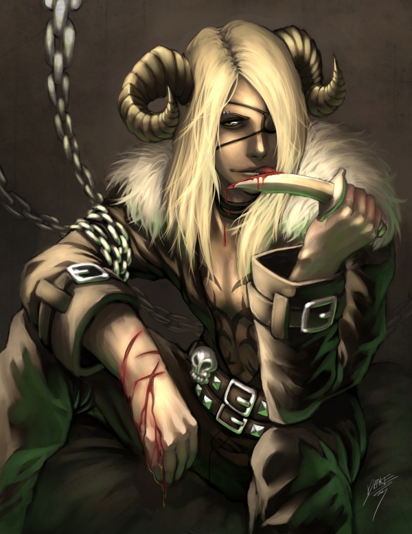
Commission for =LunaticSupernova

Cain likes fighting, and blood?


- Cain belongs to =LunaticSupernova
- openCanvas4.03, Adobe Photoshop CS3
Add a Comment:
 
love 0 0 joy 2 2 wow 0 0 mad 0 0 sad 0 0 fear 0 0 neutral 0 0
:iconizzymarrie:
~IzzyMarrie Mar 21, 2013  Hobbyist Writer
Holy crap this is a cool design. I know this is an old painting, but I just wanted to say that I love the detail you had back then (although, the blade looks like it isn't steel, but instead is made of sharpened bone, but h*ll, that makes it unique). Anyways, lucky commissioner, lol
Reply
:iconblood-fridge:
~Blood-fridge Apr 22, 2012  Hobbyist Digital Artist
Hi , you are featured in my journal: [link]
Reply
:iconkaitoupirate:
~kaitoupirate Oct 14, 2011  Hobbyist General Artist
Really, really love the lighting and colors on this one. And you portray his bloodlust so intently. I love it. :)
Reply
:iconlycanfangs1941:
~LycanFangs1941 Sep 11, 2011  Hobbyist Traditional Artist
Hah, someone tried to use this for an image for a shitty oc on a site I was a mod on.
Reply
:iconfuego-fantasmal:
Muy buen dibujo.
Reply
:icongamereviewski:
what paint do you use
Reply
:iconcooldesigns:
~cooldesigns Oct 23, 2009   Interface Designer
looking hot blooded...
Reply
:iconblindedxblack:
hehe
You got the pant seam wrong. it doesn't go with the folds and its not the right angle with the rest of the picture.
And the blood is a couple shades too light but EVERYONE gets that wrong.
The jacket doesn't crumple up by his waist, at least not as much as its supposed to. Also, there's just something wrong with where the edge of his jacket meets the skin. Not enough shadow? Too light? I don't know. something just strikes me as off in that spot.
One more thing. May I direct your attention to his Right sleeve? The clothe seems thicker on this sleeve then on the other one...???

But all in all, besides the minor mistakes that everyone makes, its an amazing picture. The angle is real good. I like how the lighter stuff is concentrated into one spot, making it into a really strong focal point. Great job with the chains. They lead the person's (lookers? observers? Watchers?) eye toward the focal point and body of Cain.
Great work of art!


Sorry, I noticed all the comments were 'really cool' and 'its amazing'
Thought I'd give you a break and critique something and this piece of art caught my eye. I really do love it. ^^
Reply
Add a Comment: